Brochure Project

brochure finalbrochure final2

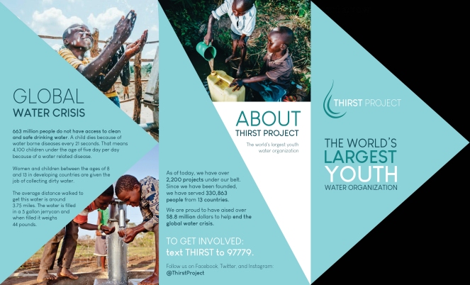
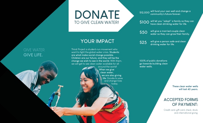
Project overview: For this project, I created a two sided brochure for a socially responsible topic. Keeping in mind that I wanted my subject to be compelling and benefits others, I chose to do one for Thirst Project and the global water crisis.

Message/Audience: I wanted to create a fun and modern looking brochure while keeping in mind that I wanted a clean feel. I focused on a student-age audience since that’s what Thirst Project strives to work with. I wanted my message to be heartwarming and inspiring.

Things you learned: I learned how to text wrap things in InDesign for the very first time. I also learned how to creatively cut images in different shapes while using InDesign.

Meeting with instructor: My professor helped me with a few alignment issues and helped me pick where I should use left alignment, and where I should use right.

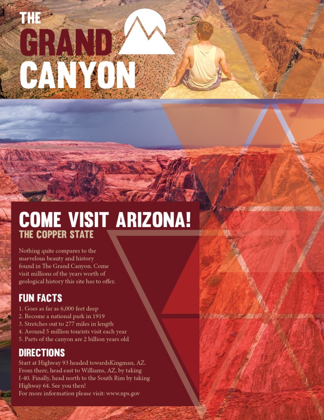
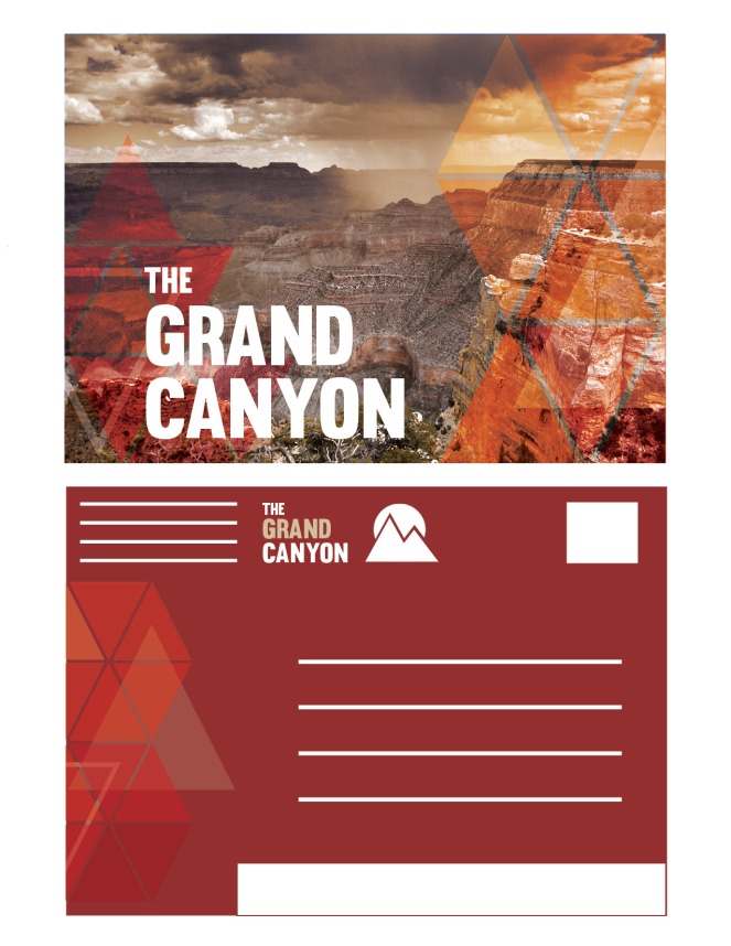
Color Scheme: I chose a monochromatic blue color scheme since its iconic for this company. Also, it help emphasizes the message of water, and I think it makes it look more contemporary.

Fonts: I used Louis George Café for all the text, and in different weights.
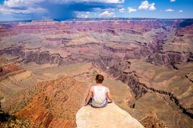
Images:

All images come from https://www.thirstproject.org/
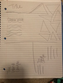
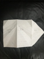
SketchIMG_6338IMG_6339

Branding Package

Project overview: For this project, I was asked to rebrand one of my favorite candy companies. I chose Swedish Fish and made them a new logo, a new look, and I wrapped it all together in this presentation book.

Message/Audience: I wanted to create a more cohesive and modern look for this project. Something that grabs the attention of children when they walk through the store, and something people can easily remember. I wanted the colors to stick out the most.

Things you learned: I learned how to use Photoshop and Illustrator in InDesign better than before. I also learned how to create multiple variations of a logo and how to tie in certain aspects throughout the presentation book. Finally, I learned how to make a container 🙂

Critiques/Revisions: I met with a few classmates multiple times and my teacher on what to fix. I fixed a few alignment issues and color picks in the very beginning, and from then it was just some easy adjustments to really sell the product.

Color Scheme: I chose an analogous color scheme to really test myself. Since the original candy packaging is a bunch of crazy colors, I wanted to stray away and create something interesting.

Fonts: I used Trashhand for my titles and Keep Calm for my body copy.

SketchesIMG_5827.jpg


Resume


finalresume
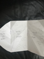
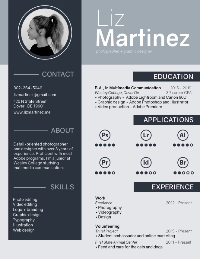
Project overview: For this project, I designed and created a custom resume for myself. I wanted to make something that was unique and helped me stand out. Using what I learned about resumes, I tied it all together with this project.

Message/Audience: I wanted to come off as creative yet professional. With this calm color scheme and simple font, I also wanted to give off a modern vibe. I wanted my skills and what I have to offer to an employer to be prevalent as well.

Things you learned: For the activity, I learned so much about how many things go into making a professional resume. I also learned just how important hierarchy is and that subheadings can make all the difference.

Meeting with instructor: My professor helped me pick a color that wouldn’t print too dark but still complimented my color scheme. He also helped me find better alignment and helped me make my education section more visually appealing.

Color Scheme: I used a monochromatic blue (my go-to, obviously) to add a pop of color but still remaining professional.

Fonts: I used the font Gravity throughout this design in different font weights.

Sketch:

IMG_4884.jpg


National Park Project

finalnationalpark

finalnationalpark2

Project overview: For this project, I created a flyer and a matching post card for the Grand Canyon. I wanted to create a fun advertisement that caught people’s attention while also emphasizing the beauty of this national park.

Message/Audience: I wanted the audience to visit Arizona, but most importantly the Grand Canyon. I wanted this flyer and post card to come off modern and fun so I tried to use the colors and shapes to my advantage. I also wanted them to be cohesive with all the elements.

Things you learned: I learned how to use shapes in a new way that seems to be a modern trend. I also learned how to play with more than a monochromatic color scheme by using an analogous color scheme. I also learned how to create strong cohesion between three different pieces.

Meeting with instructor: My professor helped me with adding more repetition throughout my postcards. He also helped me create better contrast between my colors.

Color Scheme: I used an analogous color scheme to try something new and really help the canyon stand out more.

Fonts: I used Muro for the title text and minion pro for the body copy.

Images:  sam-loyd-499655.jpgfrancisco-morais-66036.jpgoleg-chursin-322812.jpg

https://unsplash.com/@samloyd

https://unsplash.com/@olegchursin_photo

https://unsplash.com/@morais

Sketch: IMG_4821.jpg

Final Portfolio

Things you learned this semester: This semester I learned so many new things, especially since I’ve never touched adobe before this class. First major thing I learned was masking and blending, once I got that down my project became nicer and easier to do. Second thing I learned was the importance of typography and color schemes, they can make or break projects. Finally, I learned tons of shortcuts to speed up my time in Photoshop and Illustrator (comm. Z, comm. T, comm R, comm ;, etc)

Revisions: For the first project, I redid the entire things and developed a new design and concept. I spent around an hour and half to forty-five minutes on that. Then I revised project 6 a bit with dodging and burning which took about 30 minutes to seem realistic and the way that I wanted it. Then I worked on project 7 for about 20 minutes fixing some cropping errors and sharpening certain images. Finally, I worked on project 10 for around 40 minutes just fixing some masking issues I had and trying to control some of the bright highlights on some of the butterflies.

Holiday Greeting Card

holidaydraft

Project overview: For this project, I got to create a holiday greeting card for Tiffany and Co. for it’s clients. I used all original and custom designs that I made in Illustrator. I wanted my final product to create a Christmas scene that’s very detailed and displayed the company well.

Message/Audience: Tiffany and Co. is a very simple and elegant company, so they inspired me to create something fresh and sophisticated. I wanted a holiday card that applied to all the holiday celebrated during this time of year, and that also seemed personalized for all their clients.

Things you learned: I learned how to work with an all pastel colored project. I also learned how to make the reindeer fit well with the overall vibe of the design.

Color Scheme: I used a monochromatic tiffany blue (or green, however you see it) color scheme with a slight pink/red accent. I used this to make the card feel like Tiffany’s while also helping out the winter theme I had in my design.

Fonts: I used Sweet Pea for my decorative font and Myanmar MN for the body copy.

Draftholidaydraft

Client Project

finalclient.jpg

Project overview: For this project, we went out on our own to find a client to do some design work for. With no real restrictions, I got to use my own creative freedom to create a flyer for a financial coach. This is a call to action flyer that represents a company called Stand by Me.

Message/Audience: My client wanted a more modern design that had shapes, so I created a clean flyer that incorporated a geometric background. I also wanted the color and call to actions on the page to inspire those to come in and work on their finances.

Things you learned: I learned to use geometric shapes in a new way, and how not to over do it. I didn’t want my design to be too cluttered or hard to navigate so this project helped me work on my hierarchy.

Meeting with instructor: My teacher helped me pick out a new green color (different from my draft), and he also helped me refine my design so I had more negative space.

Color Scheme: I went with a monochromatic green color scheme to give the feeling of money and finances.

Fonts: For this flyer I used Liberation Sans all the way around.

Images:

dollar-currency-money-us-dollar-47344.jpeg

https://www.pexels.com/photo/1-us-bank-note-47344/

Home

Web Mockup

finalbenandjerrys.jpg

Project overview: For this project, we were asked to create a new home page for either Ben and Jerry’s, Lego, or Mazda. I created a web page that included call to actions, header with logo, navigation, content areas, and links.

Message/Audience: I wanted to create a web page that was fun and bright. I wanted the overall vibe to be welcoming and modern. I played with circular and rectangular shapes paired with a sharp and easy to read font.

Things you learned: I learned how to position and arrange things on this size document. I also learned how to grab viewer’s attention and call them to action with different content areas on the page.

Meeting with instructor: My teacher helped point out some alignment issues, and he also guided me in the right direction for what my main call to action should be.

Color Scheme: I chose a monochromatic purple (or red, depends on how you see it) color scheme, with an accent of yellow. The original Ben and Jerry’s logo inspired me to add that pop of yellow to really set certain things apart.

Fonts: I used Ge Body for title fonts and Chivo for the body text.

Imagesian-dooley-281897rachael-gorjestani-154906.jpgbrooke-lark-325182 (1).jpg


https://unsplash.com/@nativemello

https://unsplash.com/photos/8beTH4VkhLI

https://unsplash.com/@rachaelgorjestani


Infographic Project

infofinal

Project overview: For this project, I created an infographic about one of my favorite holidays: New Year’s Eve in New York City. After some research, I made icons and graphics to help deliver what I learned.

Message/Audience: I wanted to give a feel of what New Year’s is like in the Big Apple. From the crowds, to the weather, to even the clean up efforts. This is for anyone looking to spend their holiday in the city, and what they should expect to see.

Things you learned: The most important thing I learned during this project was how to make icons to tell a story. I learned how to make graphics do all the talking, with actual words just being a small part.

Meeting with instructor: My teacher helped make my color scheme more cohesive, and also helped me get some ideas of what to fill my infographic with.

Color Scheme: I used an analogous (purple, pink, red) with a neutral white. These colors remind me of parties and an overall New Year’s vibe.

Fonts: I used “Sun Valley” as my script text, and “Cabin Medium” for my body copy.

Creative Self Portrait

creativeportrait

Project overview: For this project, I created a self portrait and added some Photoshop magic to make it fun and interesting. With some prior knowledge and some research on double exposure edits, I created this portrait of me, San Francisco, and birds.

Message/Audience: San Fran is one of my favorite cities, and I think the freedom it makes me feel was a good message to put behind this portrait.

Things you learned: I learned so much about double exposure, what makes it look good, and what doesn’t. It seems like an easy task, but it took me a while to get the hang of it. I also learned some new brush settings.