Project overview: For this project, I was asked to rebrand one of my favorite candy companies. I chose Swedish Fish and made them a new logo, a new look, and I wrapped it all together in this presentation book.
Message/Audience: I wanted to create a more cohesive and modern look for this project. Something that grabs the attention of children when they walk through the store, and something people can easily remember. I wanted the colors to stick out the most.
Things you learned: I learned how to use Photoshop and Illustrator in InDesign better than before. I also learned how to create multiple variations of a logo and how to tie in certain aspects throughout the presentation book. Finally, I learned how to make a container 🙂
Critiques/Revisions: I met with a few classmates multiple times and my teacher on what to fix. I fixed a few alignment issues and color picks in the very beginning, and from then it was just some easy adjustments to really sell the product.
Color Scheme: I chose an analogous color scheme to really test myself. Since the original candy packaging is a bunch of crazy colors, I wanted to stray away and create something interesting.
Fonts: I used Trashhand for my titles and Keep Calm for my body copy.
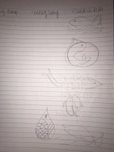
Sketches: